
From “Meh” to Modern
Overhauling a School Website
The Story
Brooklyn Waldorf School humble beginnings were four parents talking on a street corner. Over the next ten years, it rapidly became a multi-million dollar not-for-profit organization with a thriving community, housed in a historic building.
The BWS’s first website was built by a parent with high hopes, but limited expertise, leaving behind a heavily customized, unstable WordPress theme that was continually hacked. To secure and stabilize the site, we ported it to a proprietary CMS, built by the school’s Student Information System (SIS).
Though the website was now stable and secure, it was locked in to our vendor’s clunky CMS, and was in dire need of an complete overhaul in all aspects.
The Team
1 graphic designer
3 copywriters
1 web developer
1 marketing professional
1 board representative
2 teachers
Yours Truly
My roles were
Project manager
Information architect
Content strategist
Photographer
Strategy
Discussions with stakeholders revealed plenty of opportunities for improvement, including:
- The school was undergoing a re-brand, and the site needed to reflect the new aesthetic
- Enrollment in the middle school was low
- The school was transitioning to a new SIS, but the site was under the old SIS’s control
- Inquiries from prospective parents had plateaued
- Updating the site was difficult for school staff
Discovery
Discussions with users showed that the site seemed “dated” and “not together,” making a poor first impression of the school.
A review of the content revealed:
- The information architecture, naming conventions, and menu structure could all be clearer
- Internal information for parents was placed in the public “Contact” section of the site
- The tone of the copy was inconsistent, and often dense.
- The enrollment process, though relatively simple in real life, seemed daunting
- There were several “coming soon…” pages
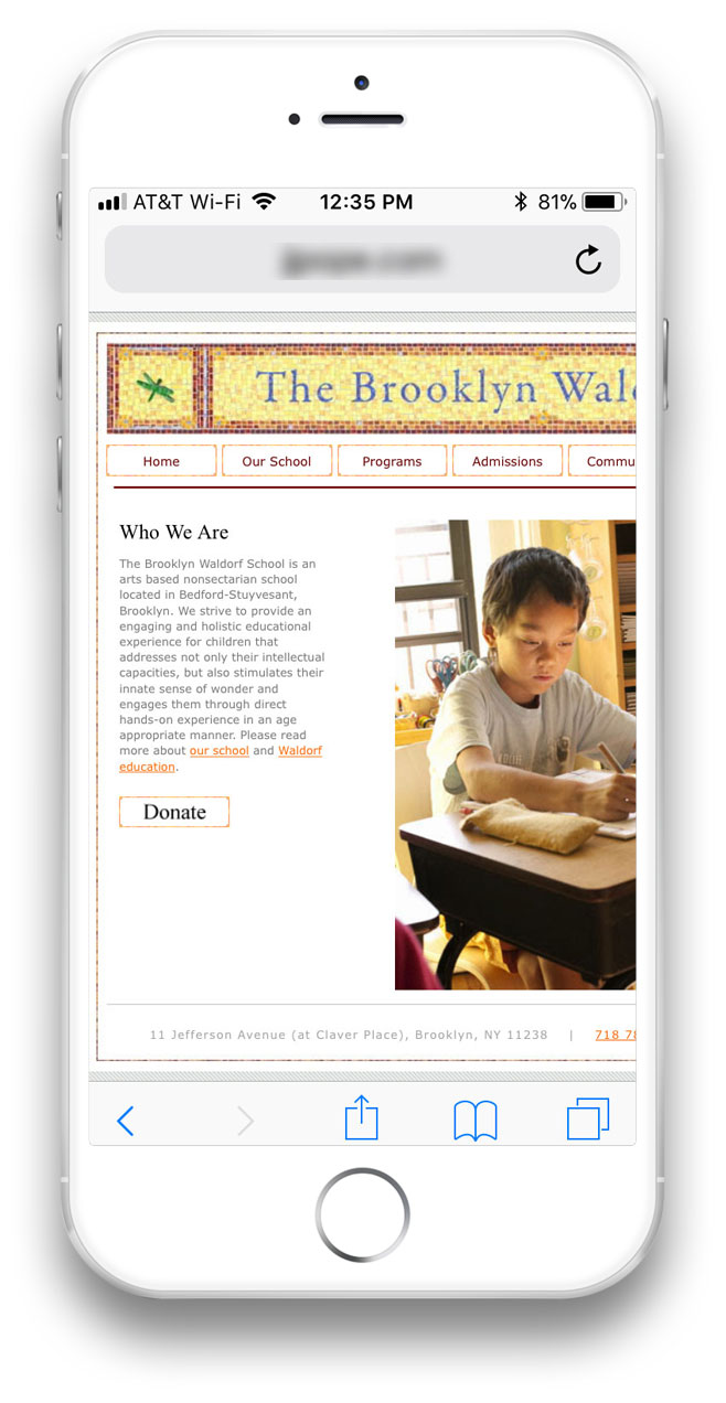
Bounce rate on mobile was high for obvious reasons.
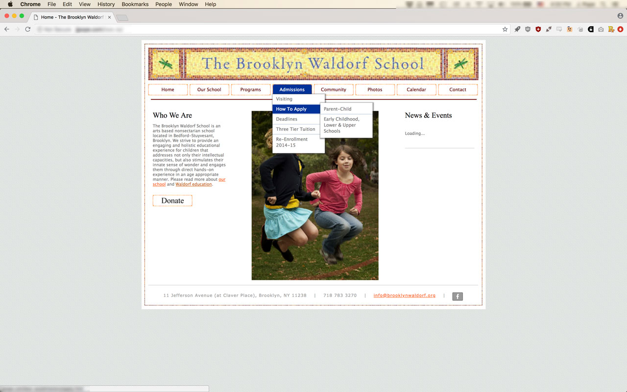
On the original desktop site, we found the nested menu structure to be an unnecessary burden. We also found that the overall site architecture could be improved.
An analytics review showed that users:
- Were increasingly using the site on mobile devices, but spent longer time on the site while using a desktop
- Were most interested in: Early Childhood, School Calendar, Tuition, Enrollment Process, Photos
- Bounced 72% of the time
The most visited links for community members were the calendar and resources.
The team examined several competitors’ websites. We liked the clean looks, and smart, friendly, concise language that connected to their target demographic. We evaluated several web platforms. In order to meet the school’s current and future needs, we decided to port the site to WordPress and develop a custom theme. This
Analysis
Personas & Use Cases
Since the admissions department had a deep understanding of prospective parents, I asked them to create two personas so the team had an audience to gear our content towards. Based on our data, we established several ideal use cases, most of them ending in some form of contact with the school — preferably registering for a school tour.
I created two personas of current parents. It was clear to me that, besides the public calendar, the majority of information for current parents should be easily accessible and organized in the new Student Information System, with persistents links to each throughout the public-facing site.
Design
Information Architecture
I used the card sorting method to organize the site — beginning with what was on the current site, and adding pages the team agreed we should implement. I was able to eliminate some pages, combine others, and re-imagine the major sections of the site.
These stacks of cards were used as a basis of a site map draft made in Omnigraffle:
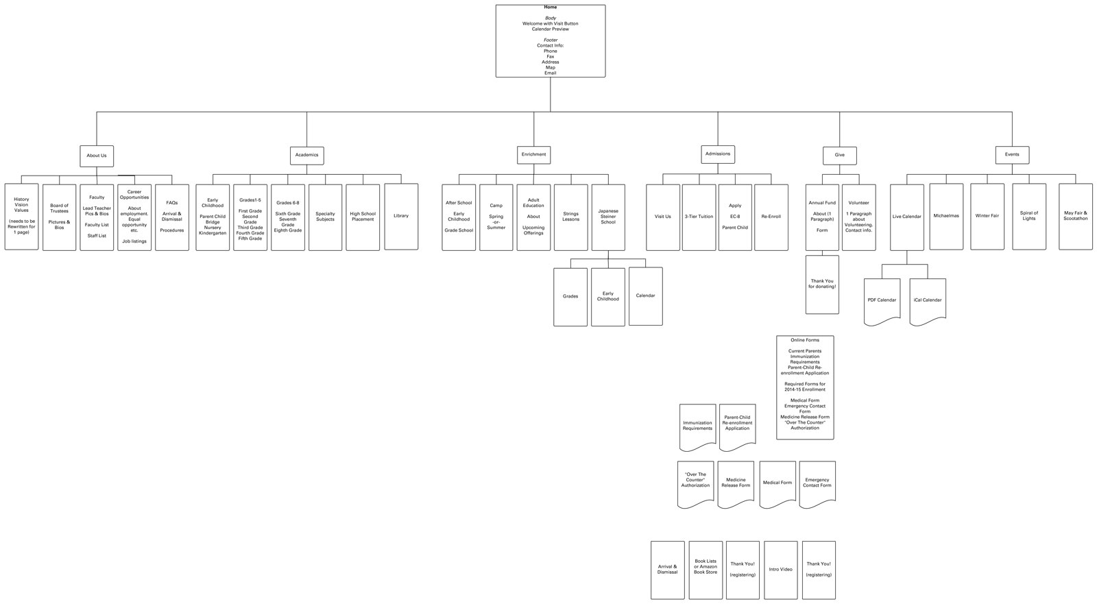
I presented this site map to the team, who helped with further consolidation and naming of sections, putting emphasis on the education itself. We put our early childhood, grades, and middle school sections front and center; and rolled the pieces of the “enrichment” section into their respective grades. “Events” became “Culture”, and the calendar had a persistent link on the top left of the site. All the various internal communications pages found at the bottom of the chart were migrated to the private Student Information System.
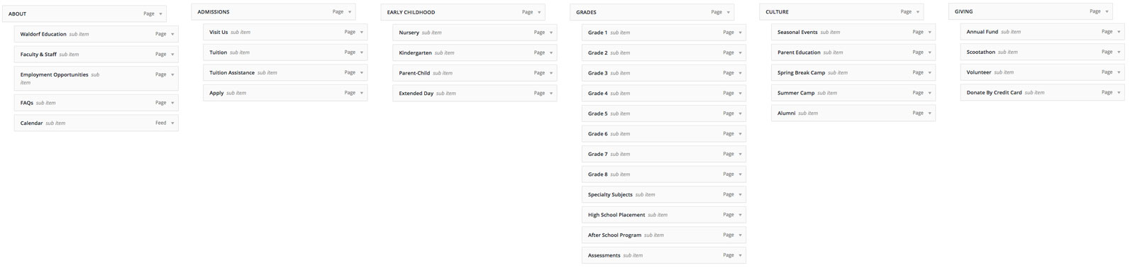
Here is the revised site architecture, as implemented into the WordPress prototype:
Content Strategy
Branding documents emphasized the need for the school to move away from the image of a funky startup school with a mysterious, anti-technology pedagogy that caters to early childhood. The board wanted to move towards being seen as a proven, academically rigorous form of alternative education which develops all aspects of its students and prepares them for a rapidly changing world.
The copywriters worked with teachers to come to a happy medium which touched upon the depth of their work without sounding too esoteric, with an emphasis on rigor, using a friendly, straightforward tone which spoke to our personas.
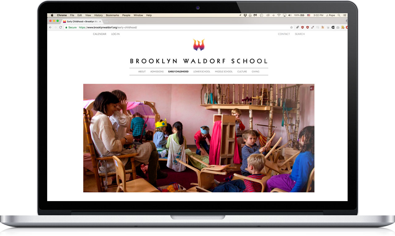
Waldorf schools have a unique aesthetic, and we decided to capture that not in the design of the site itself, but in photographs. Fortunately, I had been methodically photographing every aspect of the school for years. These inherently colorful images showed prospective parents what their children would experience, and served as a focal point in contrast to the typography-based site design.
Production
The designer and developer worked together to create a custom theme, with an emphasis on typography and white space. Meanwhile, the copywriters refined their language, and I organized and processed the photos to make them as lightweight as possible.
We also came up with a change management plan. The parent community was informed that the site would be changing, and got them acclimated to going to our new SIS for internal information.
With the site in pretty good shape, we ran some further user tests. It worked well on mobile, only requiring the standard typographical adjustments.
The design and content were well received, but the speed of the site was a glaring issue. A call to the hosting service to upgrade the school’s plan ensured the site would load quickly.
We launched the site just before the beginning of a new school year, giving the school an updated, more mature look and feel, targeted to prospective parents.
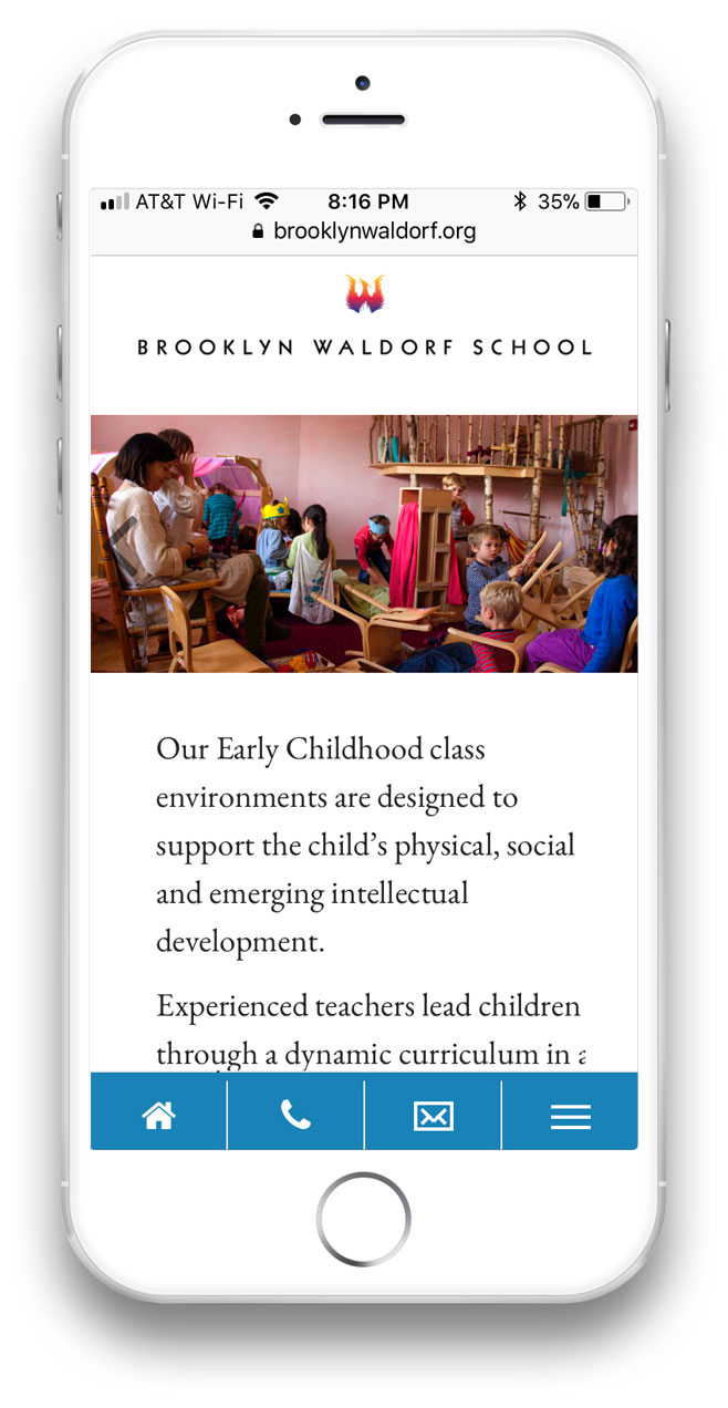
Responsive design made navigation and contacting the school easy.
The new site separated its to two users: current and prospective parents.
Current parents could access the calendar, and internal information through the pervasive links on the top left corner.
Prospective parents had an easier time navigating the site, and contact with the school was always a click away.
The minimalist design provided a stark contrast to the vibrant photographs which showcased the school.
Results
The site was well received by the community, and our colleagues at other Waldorf schools. After three months, analytics revealed a decrease in bounce rates (particularly on mobile), and an increase in visit duration. Admissions reported call volume increased, and that tour registrations had filled up faster than the previous year, requiring them to schedule another one to accommodate the increased interest. Internal staff found it easier to update their respective sections, freeing them to focus on other duties. The majority of current parents quickly registered for the new SIS. Some gave positive feedback on their ability to access so much information in one location.
PS
The site continued to change after I left the school, and I cannot vouch for the design decisions that have been made since my departure. This is a common issue with school websites, multiple people with varying degrees of design skills updating and adding to the site after the original design team disbands. It frequently leads to less-than stellar user experiences. Budgetary, personnel, and management issues all play a role in the situation.
From Potential to Essential
Strengthening the heartbeat of a community
From Friction to Flow
Streamlining a critical process
jjpope@gmail.com
(917) 690‑4122