
From Potential to Essential
Strengthening the heartbeat of a community
The Story
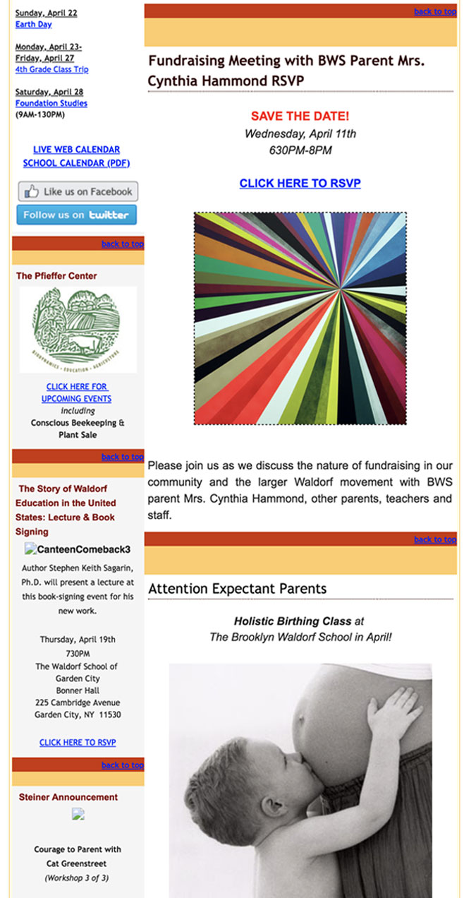
The Brooklyn Waldorf School’s weekly electronic newsletter is the lynchpin of its internal communications strategy. Parents, teachers, staff and board members all look to it for information about the bewildering number of events in the community. Unfortunately, the school had been consistently struggling in this area.
An out-dated template presented densely-packed, disorganized information. Corrections and addenda frequently popped-up in already-crowded inboxes at all hours, on all days. Community members became frustrated with the communications from the school — some to the point where they stopped opening emails and began to disconnect. Some families leaving the school cited the school’s “lack of professionalism” as a reason for leaving — and the enews was a prime example of this impression
The Team
1 admissions director
1 business manager
1 web developer
Yours Truly
My roles were
Project manager
Information architect
Content strategist
Copywriter
Graphic Designer
Photographer
Strategy
Discussions with stakeholders revealed a wide range of attitudes about the school’s electronic communications, notably:
- Administrative leadership was unhappy with the timeliness of delivery
- Teachers were stated they received too many emails from the school.
- Parents thought that emails were sporadic. They wanted to be informed, but felt overwhelmed by “information overload.” They also noted that the newsletter was difficult to read — particularly on mobile devices. Some complained about never receiving communications from the school.
My goal was to address these issues, and provide the community with information that was:
- Timely
- Accurate
- Holistic
- Digestable
- Consistent
Doing so would help the school’s desire to be seen as stable, mature, and reliable institution, and ease the information overload many were experiencing.
Measuring Success
Success was measured by the number of email opens; links clicked would gauge interaction.
Qualitative feedback from the community members would also be taken into account.
Discovery
The original newsletter was a great start, serving its purpose during the chaotic time of the school’s rapid growth. Now that the school had matured, it was time for the newsletter — and communications in general — to catch up.
A review of the analytics showed that emails were opened around of 51% of the time — with 60% of those opens on mobile (which was trending upwards).
An audit of previous newsletters revealed a number of issues. In general: the layout, content, format, timing, and voice could all be better.
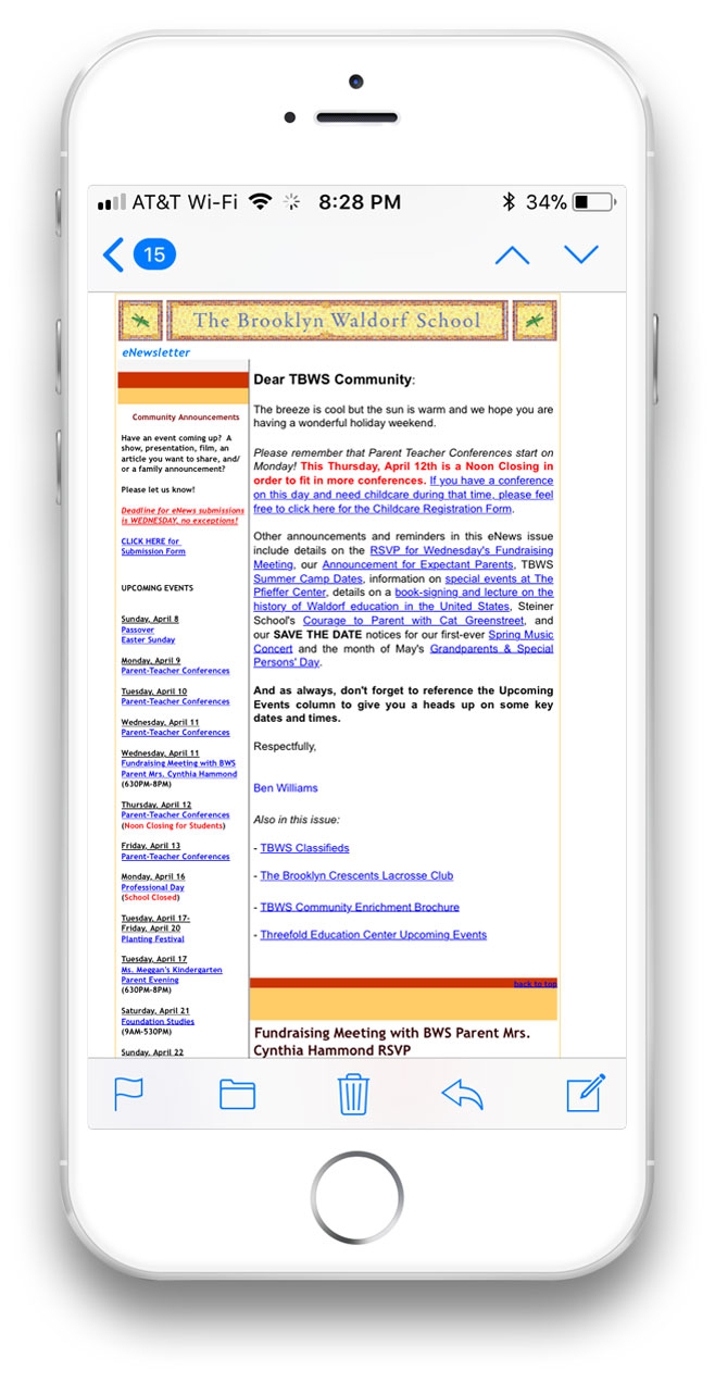
Users had difficulty reading and navigating the eNewsletter on mobile devices.
The two-column layout worked okay on desktops, but more and more parents opened these emails on their phones.
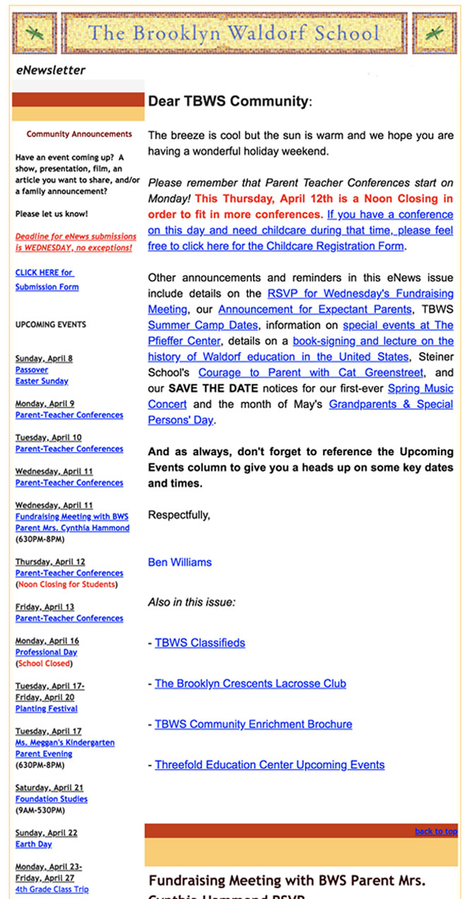
Less-than-stellar typography made the hierarchy of information difficult to discern, resulting no place to rest the eye .
The school’s unique aesthetics and plentiful events were just begging to be shared with the community.
Analysis
I created three personas based on parents and teachers.
From there, I wrote out use cases for each. These exercises re-affirmed the fact that mobile friendliness was crucial. Most community members were extremely busy, but they were also interested in what was happening in the school. Almost all enjoyed their involvement in the community, but had precious little time.
Design
The first design decision was a platform change. We moved from Constant Contact — which had zero mobile-friendly templates and a clunky user interface — to MailChimp, which excelled in their mobile support and smooth UI
I then made index cards, each representing the different types of information, its sources, and audiences. From there, I organized them, which formed the basis of the information architecture.
Conversations with administrative leadership led to a decision that two types of emails would be sent: a weekly newsletter, and dedicated emails.
Re-imagining the weekly eNewsletter
Building on interviews, analytics, user tests, and content audits, we set forth on designing a weekly newsletter that would serve the school and its thriving community.
Information Architecture
Referring to results of the card-sorting process, I came up with the following information architecture for the weekly newsletter:
These were typically from the administration or board. If there were no announcements, this section was omitted.
2. Photos from the school week
Photographs taken around the school — ideally featuring one from the grade school, and one from early childhood. These drew the user in — and if they saw nothing else at least they’d have a glimpse into the school
3. Next week’s events in detail
This put everybody knows what’s right around the corner.
4. “Looking Ahead”
A brief overview of the following three weeks in list format. Contained the essentials: times, events, and locations — with clickable links to the details if applicable
5. Details from “Looking Ahead”
Mostly used for planning large events or RSVPs. Sometimes this section was omitted.
6. General announcements from the School
Basketball scores, reminders, updates, etc.
7. Announcements from the community and its partners
These could be invitations to outside events, apartments for rent, childcare offers, etc.
Content Strategy
Copywriting
BWS parents are extremely busy, but they also want to know what’s going on in their community. They don’t want to miss out, but they also don’t have a lot of spare time to read. So, when it came to writing and editing copy, I worked hard to make it as clear and concise as possible.
Photography & Image Selection
Quite a few parents expressed their curiosity about the day-to-day goings on at school, so I worked closely with teachers to gain access to their classrooms an photograph their lessons in action. The unique, beautiful aesthetics of the school environment provided an excellent backdrop for images. This proved a unique opportunity to meet the needs of parents, while simultaneously promoting the school and Waldorf education.
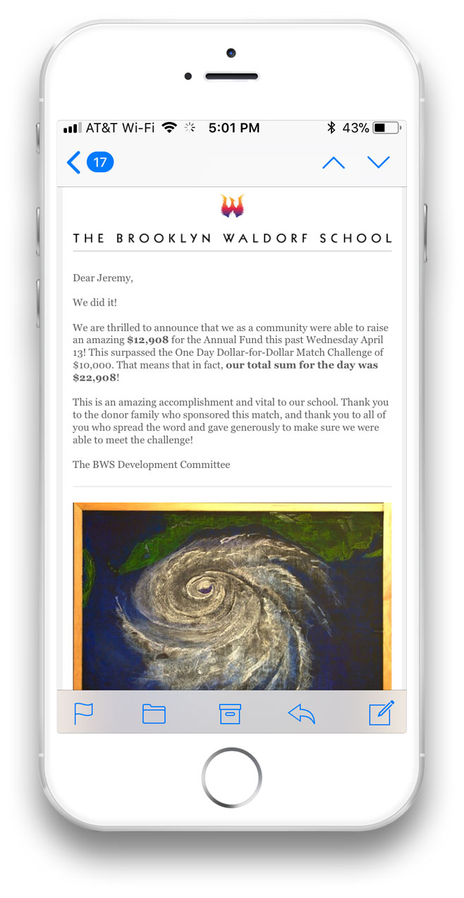
Dedicated Emails: designed to stand out in a crowded inbox
The second type of email was called a “dedicated” email. These were designed to focus the community’s attention to a singular item. The information architecture was as follows:
2. Personalized greeting
3. Introduction
4. Impactful cover photo
5. Detailed information about the event
6. Call to action
Stop the Madness! Establishing a sensible schedule
I worked with administrative leadership to establish an organizational policy for sending emails. The school would only send emails on Tuesdays and Fridays (excepting emergencies).
- eNews is sent every Friday afternoon, giving parents an opportunity to read it over the weekend and plan for the following week.
- Dedicated emails can be sent on Tuesdays or Fridays
This would establish a steady rhythm of communication, and ease some of the information overload.
Working within this structure, I established publications calendar for the entire school year — giving us a bird’s eye view of what needed to be communicated when. This became the catalyst for a number of internal production schedules.
Production
Introducing eNews
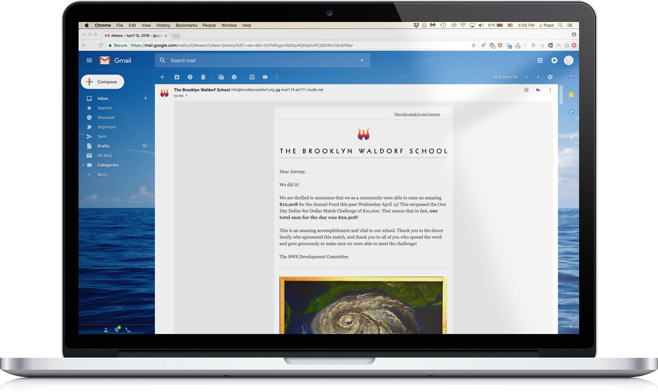
We re-branded the weekly newsletter as “eNews” — shortening the previously titled “eNewsletter” to convey the new streamlined approach. eNews was the centerpiece of the school’s internal communications strategy.
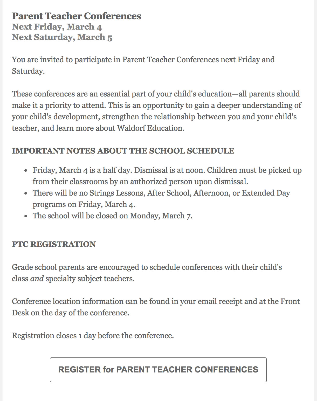
A typical “school announcement” in eNews. I strived to convey a large amount of information in an easily digestible way by using clear, succinct language.
The call-to-action of this important event was designed to stand out amidst scrolling and scanning.
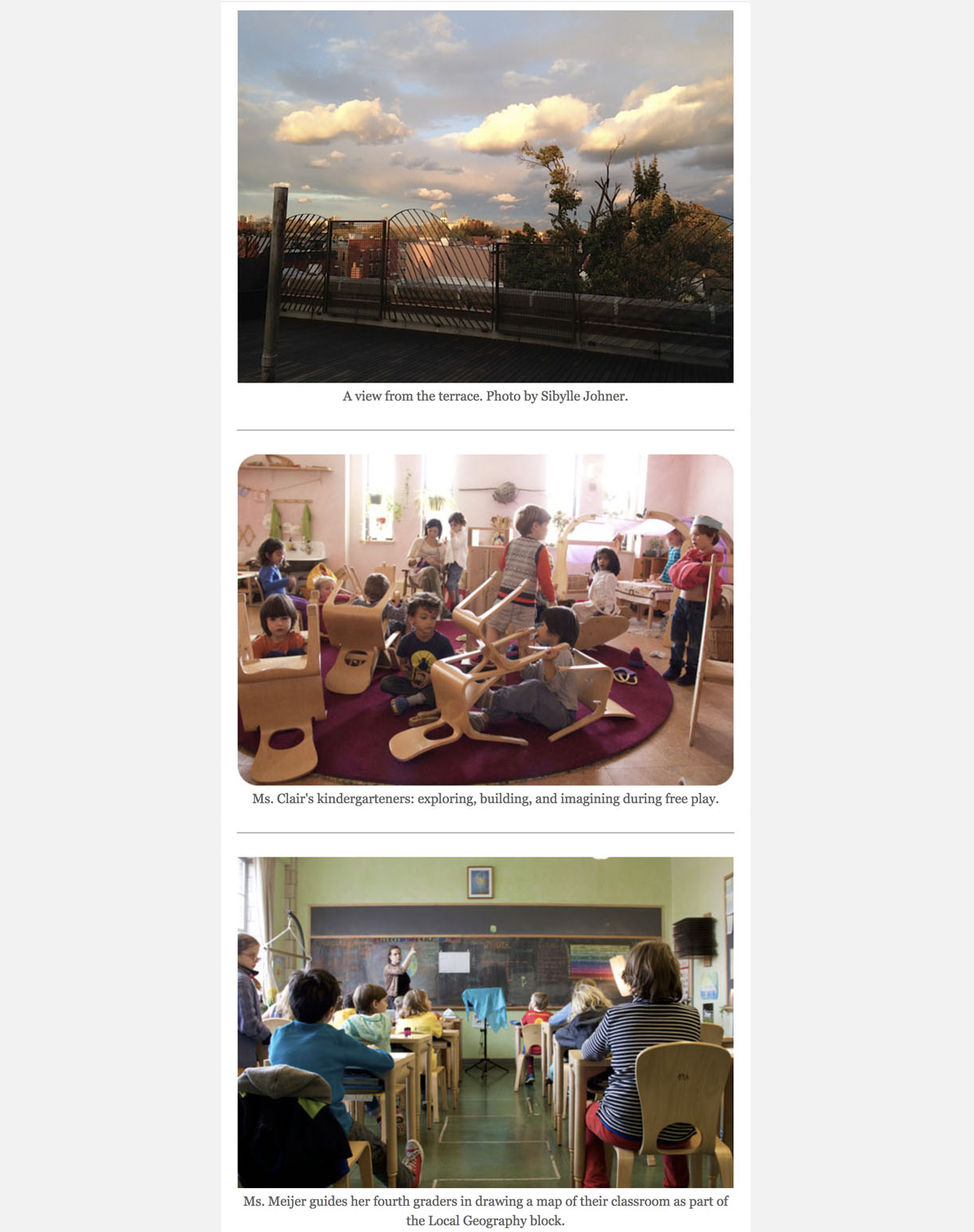
We showcased different areas of the school near the top of the email to draw the reader in. Here we see a terrace view, kindergarteners in free play, and a fifth grade classroom.
Note the rounded corners on the kindergarten photo — a nod to the Waldorf practice of using round-cornered paper until fourth grade.
Dedicated Emails: Announcements with Impact
Sometimes, it was a carefully crafted ask from the development committee. Other times it was a detailed overview of an upcoming event — typically with a call to action like “volunteer” or “RSVP.”
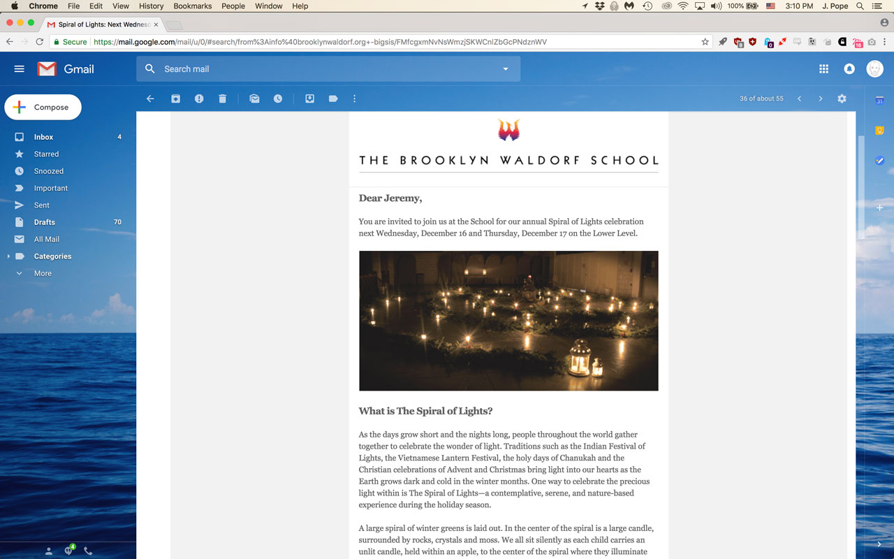
A dedicated email inviting community members to an annual event called “The Spiral of Lights.” It contained detailed information about the event in a simple, elegant format.
Note the personalized greeting, which conveys warmth and professionalism. I worked with our Student Information System team to sync the school’s ever-changing database to MailChimp, which saved time, reduced bounces, and ensured everyone was up-to-date.
A truncated version of this announcement — pared down to the essentials — would appear in the upcoming eNews. It linked back to this dedicated so people had easy access to the details.
Results
eNews was well received by the community, and it soon became the lynchpin of the school’s internal communications strategy. Opens went from 43% to 62%, and links clicked rose by around 20%. The design continued to evolve over time, but the work outlined above laid a strong foundation for organizational communication.
From Friction to Flow
Streamlining a critical process
From “Meh” to Modern
Overhauling a website after rapid organizational growth
jjpope@gmail.com
(917) 690‑4122